Create a Modern CSS-only Fold-Out Burger Menu
For the last couple of months, I have been working on a custom Hugo theme in my free time. Most recently, I implemented a CSS-only burger fold-out menu to increase its responsiveness. I based the implementation on Erik Terwan’s nifty pure CSS Hamburger fold-out menu which is pretty popular on CodePen. I modernized it by utilizing SVG and newer CSS selectors to make the code more declarative and scalable. It comes with the price of not supporting as many browsers, but honestly, who cares about Internet Explorer users?
What the Result Looks Like
Have a look at the result (it’s interactive):
All of the illustrating examples use the following basic styling:
.example {
  background: #3c3836;
  color: #ebdbb2;
  height: 200px;
  overflow: hidden;
  position: relative;
  width: 300px;
}
Burger Anatomy
As a starting point, I chose the menu-2 icon of the excellent, MIT-licensed
Tabler Icon suite:
<svg xmlns="http://www.w3.org/2000/svg" class="icon icon-tabler icon-tabler-menu-2" width="24" height="24" viewBox="0 0 24 24" stroke-width="2" stroke="currentColor" fill="none" stroke-linecap="round" stroke-linejoin="round">
  <path stroke="none" d="M0 0h24v24H0z" fill="none"/>
  <line x1="4" y1="6" x2="20" y2="6" />
  <line x1="4" y1="12" x2="20" y2="12" />
  <line x1="4" y1="18" x2="20" y2="18" />
</svg>
The icon looks like this:
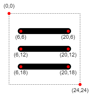
Here is a breakdown of the arrangement of the burger’s three <line /> elements
inside the SVG:

When we later animate the lines, this will be important to know.
Menu Skeleton
<div class="menu-burger">
  <input type="checkbox" />
  <svg
    xmlns="http://www.w3.org/2000/svg"
    class="icon icon-tabler icon-tabler-menu-2"
    viewBox="0 0 24 24"
    stroke-width="2"
    stroke="currentColor"
    fill="none"
    stroke-linecap="round"
    stroke-linejoin="round"
  >
    <path stroke="none" d="M0 0h24v24H0z" fill="none" />
    <line x1="4" y1="6" x2="20" y2="6" />
    <line x1="4" y1="12" x2="20" y2="12" />
    <line x1="4" y1="18" x2="20" y2="18" />
  </svg>
  <ul class="menu-burger__item-list">
    <li>Item 1</li>
    <li>Item 2</li>
    <li>Item 3</li>
  </ul>
</div>
The menu contains the burger and a list of menu items inside
.menu-burger__item-list, which initially is not displayed. The
<input type="checkbox" /> is used as an invisible, “CSS-only click handler”
indicating the menu state. Let’s add some initial CSS next:
.menu-burger > * {
  position: absolute;
}

.menu-burger input {
  height: 32px;
  margin: 0;
  opacity: 0;
  width: 32px;
  z-index: 3;
}

.menu-burger svg {
  height: 32px;
  width: 32px;
  z-index: 2;
}

ul.menu-burger__item-list {
  background: #ebdbb2;
  bottom: 0;
  color: #3c3836;
  list-style: none;
  margin: 0;
  padding: 32px;
  top: 0;
  transform: translate(-100%, 0);
  transition: transform 0.5s cubic-bezier(0.9, 0, 0.1, 1);
  width: 200px;
  z-index: 1;
}

input:checked ~ .menu-burger__item-list {
  transform: none;
}

.menu-burger input:checked ~ svg line {
  stroke: #3c3836;
}
The most important things going on here are:
- Any direct descendant of
.menu-burgeris positionedabsolutely menu-burger__item-list,svg, and checkboxinputare stacked on top of each other, ordered byz-index- The dimensions of the
inputcheckbox andsvgexactly match - To initially hide
menu-burger__item-list, it’stranslated out of view - A
transitionanimation with a customcubic-beziereasing-function is added to thetransformproperty, so the fold-out of the menu looks nice. You can play with it on cubic-bezier.com. - The “click handler” CSS magic is happening in
input:checked ~ .menu-burger__item-list.~is the subsequent-sibling combinator. In this case it matches.menu-burger__item-listsiblings of a:checkedinputcheckbox and undoes the initial hidingtransition. - The same “click handler” logic is used to change the colors of the
lineelements from dark to light
The rest is self-explanatory, generic CSS styling. Here is what we have so far:
Now that we finished building the foundation, we can continue with the fun part!
Animate the Burger
First, we style each <line /> by using declarative
nth-of-type CSS selectors:
.collapsible__menu svg line:nth-of-type(1) {
  stroke: red;
}

.collapsible__menu svg line:nth-of-type(2) {
  stroke: green;
}

.collapsible__menu svg line:nth-of-type(3) {
  stroke: blue;
}
This styles the first, second and third line of svg like so:
Let’s take a step back and think about what the animation should do:
- Fade out the middle
lineby scaling it down and changing itsopacityto 0 - Rotate the top and bottom lines to form an X. One way to do this is to vertically center both lines and rotate them by 45 degrees in opposing directions around their center.
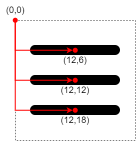
Before we get started, we have to understand how transformation origins work in CSS:
The transform origin is the point around which a transformation is applied. For example, the transform origin of the
rotate()function is the center of rotation.
In our case, the default transform-origin is (0,0). So before we apply
transformations, we have to move the transform-origins of every line to their
respective center:

.menu-burger svg line:nth-of-type(1) {
  transform-origin: center 6px;
}

.menu-burger svg line:nth-of-type(2) {
  transform-origin: center 12px;
}

.menu-burger svg line:nth-of-type(3) {
  transform-origin: center 18px;
}
Next, use the cubic-bezier function again and apply it to every line
property to be animated:
.menu-burger svg line {
  transition-duration: 0.5s;
  transition-property: stroke, opacity, transform;
  transition-timing-function: cubic-bezier(0.9, 0, 0.1, 1);
}
When clicked, we fade out the middle line of the burger:
.menu-burger input:checked ~ svg line:nth-of-type(2) {
  opacity: 0;
  transform: scale(0.2);
}
Finally, we vertically center and then rotate the top and bottom lines:
.menu-burger input:checked ~ svg line:nth-of-type(1) {
  transform: translate(0, 6px) rotate(45deg);
}

.menu-burger input:checked ~ svg line:nth-of-type(3) {
  transform: translate(0, -6px) rotate(-45deg);
}
Wrapping Up
What do you think? Let me know in the comments or at me on Twitter.
I created a JSFiddle for you to play around with the code. Here is the entire CSS for reference:
.example {
  background: #3c3836;
  color: #ebdbb2;
  height: 200px;
  overflow: hidden;
  position: relative;
  width: 300px;
}

.menu-burger > * {
  position: absolute;
}

.menu-burger input {
  height: 32px;
  margin: 0;
  opacity: 0;
  width: 32px;
  z-index: 3;
}

.menu-burger svg {
  height: 32px;
  width: 32px;
  z-index: 2;
}

ul.menu-burger__item-list {
  background: #ebdbb2;
  bottom: 0;
  color: #3c3836;
  list-style: none;
  margin: 0;
  padding: 32px;
  top: 0;
  transform: translate(-100%, 0);
  transition: transform 0.5s cubic-bezier(0.9, 0, 0.1, 1);
  width: 200px;
  z-index: 1;
}

input:checked ~ .menu-burger__item-list {
  transform: none;
}

.menu-burger input:checked ~ svg line {
  stroke: #3c3836;
}

.menu-burger svg line:nth-of-type(1) {
  transform-origin: center 6px;
}

.menu-burger svg line:nth-of-type(2) {
  transform-origin: center 12px;
}

.menu-burger svg line:nth-of-type(3) {
  transform-origin: center 18px;
}

.menu-burger svg line {
  transition-duration: 0.5s;
  transition-property: stroke, opacity, transform;
  transition-timing-function: cubic-bezier(0.9, 0, 0.1, 1);
}

.menu-burger input:checked ~ svg line:nth-of-type(2) {
  opacity: 0;
  transform: scale(0.2);
}

.menu-burger input:checked ~ svg line:nth-of-type(1) {
  transform: translate(0, 6px) rotate(45deg);
}

.menu-burger input:checked ~ svg line:nth-of-type(3) {
  transform: translate(0, -6px) rotate(-45deg);
}
